Quantcast
Channel: Recent & Good Blog Posts on CodePen
Viewing all 980 articles
Browse latest View live

Tables, Tequila and Beer

$
0
0

Billy Introduces me to Coronaritas

In a recent article tables and beers I explained how browsers correctly represent table semantics of simple tables with either a row or column of headers. Thus alleviating the need to use the scope attribute to identify a th as a row or column header. In this article I take it a little further, with tequila and beer.

Table with header cells in the top row and first column

The WAI advice meets reality

In this table, the row header cells are in the second rather than in the first column. The approach is similar to the examples above: The scope of the header cells in the top row is set to col. By using the row value for scope assigns the header cells in the second column to the data cells on the left and the right of the individual header cell.

The advice and common expert opinion is that in the case of the example table, scope is required on th elements to provide appropriate semantics. When looking at the information exposed in the accessibility tree in modern browsers it becomes clear that scope is not needed. Accessibility tree for example table 1 without scope attributes shows that the column and row headers are conveyed correctly.

Well almost:

Chrome has a bug, hopefully fixed soon..., that results in the th in column 2 being incorrectly exposed as rowheader if the preceding element is a td

There are 3 methods to work around this bug, thankfully none of them involve adding scope to every th in the table.

Method 1

Add scope="col" to the first th in the column header row.

  ...
<tr>
<td></td>
<th scope="col">Monday</th>
...

Method 2

Change the td to a th leaving the th empty.

  ...
<tr>
<th></th>
<th>Monday</th>
...

Method 3

Change the td to a th and adding some useful information about the column it is acting as a header for.

  ...
<tr>
<th>Times</th>
<th>Monday</th>
...

Conclusion

Modern browsers expose the correct semantics for th elements in both column and row headers in simple data tables. This information is used by screen readers to convey correct header and data cell relationships to users.


Creating vector-like CSS illustrations

$
0
0

There are several posts out there around CSS illustrations, but not one I've read so far -correct me if I am wrong-, which talks about the technique I'll share with you today. Creating vector-like CSS illustrations, an approach I use often to create most of my illustrations, making them resizable in a matter of seconds.

The story

I joined CodePen in the year of 2015, and the first thing I did was experimenting with CSS illustrations. Four years after, I still enjoy exploring and creating pure HTML and CSS illustrations either completely designed by me, or followed by someone else's design.

The main focus of my CSS illustrations is the ability to build such illustrations in a vector-like style.

Ever since I started with some of my first illustrations, I often wanted to create not only an illustration with pure CSS, but also, if possible, make sure it'll be modular, responsive and/or scalable—easy to maintain in the future.

Now, you might be asking yourself, why bother making an illustration modular, responsive and scalable? Well, because it helps me exercise and improve the way I write CSS and semantic HTML, as well as the way I build components.

Planning vector-like CSS illustrations is always an exciting challenge.

The HTML

Beginning with the HTML, I work out my modular and scalable code by creating class names in semantic HTML elements, and using a CSS methodology, my favorite is BEM, with a mix of OOCSS and ITCSS for patterns and DRY (Don’t Repeat Yourself).

And mainly, I find myself using pug in CodePen as I write that HTML.

The CSS

The fun part, from illustrating with code, comes when writing the CSS.

To make sure the illustration would be maintainable, I thought not only using global or local variables would be enough. What if in the future whenever one wanted to change the size of the illustration proportionally, one could modify it in a blink of an eye, instead of tweaking each section of the illustration during several minutes or hours. And what if that magic could be achieved by simply updating just 1 variable in the whole CSS styles.

This is when resizable components came to my mind. I was sure, back in 2015, I wasn't the first person thinking of this, as matter of fact, maybe someone else had already applied this method on real production components, and I had no idea.

Then I googled it, and after months of exploring this idea sporadically, I found this amazing article, in 2016, by Ahmad Schadeed: Building Resizeable Components with Relative CSS Units, which pretty much approaches a similar idea, call it technique, to resize all the UI in components, including text, after detailed code examples following a SCSS function that converts px to em proportionally after a given SCSS global size variable.

The SCSS variable

My very first attempt in creating vector-like CSS illustrations started likewise by declaring one size global variable via SCSS, that would be called in later from several selectors. For example, as I drew the Sugar Skull presented below, I declared the following SCSS variable: $calavera-size.

Then, anytime I'd like to resize the finished illustration, I could always come back to that single SCSS variable and place any desired size in pixels: $calavera-size: 500px;.

Needless to say, my code back then could be improved a lot! My patterns, mixins, code organization... Oh well, this is a good opportunity to highlight that practice makes perfect. Ok, maybe not perfect, but better! If I take a look at my CSS illustrations over the years, it is a good sign to see that my code has progressed -i am sure it's the same for you-, and also the time invested into drawing with code.

Media queries vs. SCSS variables

In the past, I was a bit frustated with this vector-like technique explored so far, because of course I also dreamed of making that illustration responsive, but without adding more work to it.

I wanted to be able to simply resize that SCSS variable inside a media query and say voilà.

Sadly, redefining a SCSS variable, on its own, inside a media query didn't and still won't work. Instead one needs to do something like the following:

  $size_resizable: 600px;

.illustration {
    width: $size_resizable;
}   

@media screen and (min-width: 30em) {
    $size_resizable: 400px;

    .illustration {
        width: $size_resizable;
    }
}

And I did explore further this method, of course. But wasn't satisfied completely with the responsive code for the CSS illustrations. It was still too much work!

Next, you'll find two examples I drew back in 2016, while experimenting with resizing SCSS variables inside media queries. Drunken Watermelon and Matryoshka:

CSS variables

I believe at some point in the year of 2016 -correct me if I am wrong again, please-, CSS variables became native. And of course, yet again, I had to test them with my vector-like CSS illustration style.

Since at the beginning CSS variables browser support wasn't particularly amazing, I started testing only using them for color variables in my illustrations. For size variables I still declared them via SCSS. However, the code structure and defining dependent SCSS sizing variables from the resizable SCSS variable was improving in this vector-like technique.

Below, you'll find one CSS illustration I drew in 2017, Fight: El Santo, portraying this. Color CSS variables have the syntax: --css_var and sizing SCSS variables this: $scss_var:

Media queries vs. CSS variables

By 2018 browser support for CSS native variables only got better and better, until today -2019-.

I noticed, over those years, more CSS variables experiments were done by other people in CodePen, including complex calculations with calc working pretty decently, that I thought, now it's the time to test further CSS variables for sizing variables. But life happened, and it took me long to catch up with it, and update my vector-like CSS illustration style.

Earlier this year, I finally closed the annoying gap that was frustrating me with the responsiveness of my CSS illustrations.

I am happy to announce that my dream finally came true -I am late, I know-. My vector-like CSS illustrations can now be modular, responsive and scalable! They might not be flawless yet. It's a work-in-progress.

CSS variables are pure magic. By declaring one main global CSS size variable, one can easily create dependent CSS size variables to work proportionally, and -the best!- one can resize that CSS variable inside a media query.

   :root {    
    --size_variable: 140px; 

    @media screen and (max-width: 50em) {
        --size_variable: 80px;
    }
    @media screen and (min-width: 120em) {
        --size_variable: 200px;
    }

    --dependent_variable_01: calc(var(--size_variable) / 2);
    --dependent_variable_02: calc(var(--size_variable) / 10);
}

This means, creating a responsive vector-like illustration is no longer a hassle. And also achievable in a matter of seconds, just like its maintainance in the future, in case it needs resizing or new illustration elements.

Down here you'll find two of the latest vector-like CSS illustrations I created recently in 2019, where CSS variables are used to make the illustrations not only responsive, but also resizable by editing only 1 CSS sizing variable. New Years Balloons and Daria MTV:

Conclusion

Creating responsive vector-like CSS illustrations is possible thanks to CSS native variables.

  • Do you also build CSS illustrations with a vector-like method?
  • Have any of you already used this vector-like technique, or something similar in real production components?
  • How useful do you think this could be now, if applied in let's say a design system?
  • Have you read other posts about vector-like techniques to build CSS illustrations or components?

I think later this year I'll probably explore the web performance of this technique, as well as applying this vector-like style into components. If I do, I'll share my findings in another post.


If you want to browse all of the vector-like CSS illustration I've created so far in CodePen, visit one of my tags: tag=resize

If you're curious about my very first CSS illustration in 2015, which in fact it was also my very first pen in CodePen, find it here: Rabbit vs. Cat

If you prefer browsing more illustrations I've created in CodePen, not necessarily pure vector-like, I have three collections:


Thanks for the read.
Hope you enjoyed it. :)

If you have any kind of feedback, or opinion on how this vector-like style can continue to evolve, just drop me a comment below.

Happy coding!

Top JavaScript Dashboards For Your Web Project

$
0
0

The power of data visualization cannot be underestimated.

Regardless of the industry you are working in, you should be able to analyze the incoming data and visualize the results immediately.

We’ve picked for you the top pens with analytical dashboards.

These data visualizations help to get deeper into the meaning of your data and communicate it efficiently.

Why not to try playing with demos? They're totally interactive.

Sales analytics 📊

These dashboards reveal the information about highest levels of sales by countries and over time periods. Load the data into a pivot table and spice up your data analytics with the charts - it's as easy as pie!

Space analytics

Are you interested in everything related to the space industry? Then the following analytics is a great choice.

  • Are you a fan of NASA?

  • Or maybe of SpaceX?

Economics 📈

Ecological footprint 🌎

Food & Health 🍪

  • Analyze the nutritional value of Starbucks beverages:

  • Or McDonald's food:

Use data visualizations at full power 🎨

You can embed a pivot table into Angular, AngularJS and React projects. After that, add Google Charts to the dashboard - the pre-made integration wrappers make a process completely time-saving.

focus-within

$
0
0

Just discovered focus-within which let's you style the parent of a focused input.

  .field {
  background: #eee;
}
.field:focus-within {
  background: lightyellow;
}

Browser compatibility: caniuse#focus-within (doesn't work on IE and Edge)

The Danger Crew 2019 Edition

$
0
0

I'm kicking off 2019 by putting this out into the world: The Danger Crew is ready to play!

The Danger Crew

Play the Danger Crew!

Two of seven chapters are available in the link above. The rest of the chapters are very close but still have a lot of QA and editing to go. Desktop only, for now, but don't worry - mobile is coming! As always, the game has been through a lot of rewrites, redesigns, recoding. It's been a big year. I'm exciting to be back to share what I've learned along the way.

(The Danger What?... I've written about my project, The Danger Crew, before on my CodePen Blog. Here are some of the posts: Revamping the Battles, Introducing the Project, and I got to be on the podcast!)

I worked on The Danger Crew almost every single day since my last post in September 2017. I went through some other big and exciting personal things in the meantime, too. I got a new job! My wife and I sold our house and moved to Denver. Then I started contracting full time. Uprooting yourself and making career moves takes a lot of mental energy, but I was able to pipe a lot of inspiration from the experience back in to the game. (Which itself tries to touch on a lot of stuff people go through in tech.)

Here are some behind the scenes insight into making The Danger Crew, motivation behind keeping it going for 3 years, and takeaways that I hope will help you finish and ship your own projects. These lessons apply to anyone trying to bring big ideas to life, whether at work, on the side, technical or non technical. Let's dive in!

The Pitch

The Danger Crew is an adventure RPG in the browser. It’s about being a developer in a world obsessed with programming. Techies roam the streets with their laptops out, ready to prove themselves the most powerful programmers in the scene. Hack Battles are the law of the land... confrontations where you and an opponent type Terminal commands at each other until somebody's laptop explodes in a smoking cloud of defeat. It's serious. Today is your first day of work at a new job... you're going to have one busy day.

Tech Stack

The Game

This is a CodePen post, so let's talk about the code. Danger Crew is written in React. I bootstrapped the project with Create React App... it's a pleasure to use and I haven't needed anything more custom. It uses a little bit of Redux, too, but in a mega simple and abstracted way. If I started over right now, I probably wouldn't need Redux.

The game .js file itself doesn't contain the story content, like what people say when you talk to them or details about the room you're in. That information is loaded into the app from a JSON endpoint. More on that in a bit.

The graphics are a mix of SVGs and <canvas> rendered PNGs with an important CSS rule: image-rendering: pixelated. This rule allows simple images, like pixel art, to scale larger than natural size on a canvas without losing quality. I learned how to do that from this MDN page.

I utilize inline SVGs for icons and certain stateful graphics: like changing the path colors of your laptop when you're getting attacked.

I make the game's artwork in Aesprite. The animation and drawing features in Aesprite are really easy to use. I export PNGs out of there and sometimes convert to SVG depending on the context of the asset. Huge thanks to Shaw for making this Pen which quickly converts simple pixel art into SVG code. I've used this tool hundreds of times over the past year!

Howler is a JavaScript library that plays our music and fires the SFX. Firebase stores user accounts and player progress so you can save/continue whenever you want!

The Editor

I had a big vision for the story of this game. I wanted to provide a full adventure with the same depth, details, and gameplay length of the games I used to play growing up. Lots of content had to be created: everything from character dialogue, battle details, cutscenes, and more. All of this content would be represented in a JSON format - that way I or anybody else could continue to create more content for the game without modifying the game's bundled js file. I had really specific needs of an editor in mind, so I decided to create a custom CMS, Danger Studio:

Danger Studio editor

It's not the prettiest thing in the world, but it has all of the features I need to create and change content, at least way faster than manually editing JSON. It also manages story flag scenarios. If you talk to a person in the world, he might say line A or line B depending if you've completed task A.

Placements and configurations of Battles are handled in here too, so it's easy to iterate on the flow and pacing of how often the player encounters enemies.

Under the hood, Danger Studio is just another React app with a thin Node backend that simply reads and writes JSON files. There's a concept of Projects within it too... I can edit my own version of the game while Glenn, my game design partner, edits his own. This handy mechanism allows anybody to create additional content completely independent from the main seven chapters.

Lessons

Here are some rapid fire lessons that I've learned from making this game. Some are technical, some are not.

  • Get your work in front of early testers as soon as possible, even if the styles aren't ready or you have placeholder graphics. I arguably waited too long to get a playable version in front of friends to test which ended up biting me later because many of my assumptions were wrong.

  • Rewrites take time. If you are considering rewriting part of your project because of reasons X, Y or Z, make sure you double your estimate for how long it will take. Sometimes it's worth the time! In my case, I ended up going through a big rewrite in fall 2018 to fix some major performance problems that added a few months on to the project. (This is only nights and weekends for me, after all). I've also spent weeks chasing rabbit holes that ended up having little to no value, so be mindful how you spend your time.

  • Have a buddy. For me, it is Glenn, my game design partner. We talk every week and I share progress on what I've gotten done. He always has great feedback and helps me stay focused on the right thing at the right time. Having a person to provide feedback will keep you accountable and motivated to keep going.

  • Embrace the gap, the painful realization that your work is not yet at the level of quality you desire it to be. Your works gets better the more you pick away at it, so keep showing up. Don't be discouraged if your art doesn't look great or the code is gross. It will get better if you keep trying.

  • Share your progress, successes, and failures. Even if it's only with a few close friends.

The Danger Crew

It felt wrong to leave this post without an accompanying Pen, so here's a slideshow of some scenes in The Danger Crew. I will continue to update this post as more chapters are released.

Like I mentioned before, the rest of the The Danger Crew is actually pretty close to done... we're entering a period of story editing, QA, play testing the remaining chapters. We also have a nice little CI pipeline set up, so we can easily push enhancements and fixes. As for me, I'm excited to move on with learning Unity and figuring out what's next for me and my career.

Thanks for reading - I hope you enjoy the game!

Drew @drewconley13

Cartoonifying and animating a still photograph

$
0
0

For this week's CodePen challenge, I created an animation of bats flying over people on a bridge using a single element and a still picture. This is a photograph in JPEG format, without transparencies or vectorial possibilities.

So... how do we go from a still photograph like this (original source):

Austin Bats picture from http://www.batsinaustin.com/

to an animation like the one below, without editing the image outside of the browser, changing its format, or modifying its original content at all?

And how could we achieve it using just one HTML element and a few lines of CSS?

Let's go step by step.

The HTML

First the HTML: we need to create an element that will contain the image:

  <div><div>

And that's it! That's all the HTML that we will need. Everything beyond this point will be styling with CSS.

The CSS

Initial styling

The div should have the same proportion (width/height ratio) as the image because we will put it as background, and we want it to occupy the whole container. In our case that is easy: the image is twice as wide as it is tall, so the ratio will be 2:1.

Our initial CSS will include sizing the div and positioning it in an absolute way in the center of the screen:

  div {
  /* this height and width values are specific to this example */
  width: 100vw;
  height: 50vw;
  /* center the div vertically and horizontally to make it look nicer */
  position: absolute;
  top: 50%;
  left: 50%;
  transform: translate(-50%, -50%);
}

We will come back to this div later, but we can let it rest for now and focus on the pseudo-element that will contain the image.

The image

With the following style, we will make it occupy the whole parent container, have the image as a background, and fit the image to the whole size of the container:

  div::before {
  content: "";
  display: block;
  position: absolute;
  width: 100%;
  height: 100%;
  background: url("https://i.stack.imgur.com/w8noS.jpg");
  background-position: top left;
  background-size: 100% 100%;
}

Time to apply some filters!

The filters

Right now, the photograph is the original image without changes: a group of people on a bridge, looking at the flying bats.

We want to apply some filters:

  • saturate(0): this will remove intensity from the picture, turning it into grayscale, and causing some surrounding colors to blend together.
  • contrast(400%): by setting a high contrast value, we turn the grayscale photo into a black and white image, leaving a silhouette of the original picture.
  • invert(1): flip the colors. This is done to add dramatism: the bats fly at night, the sky now looks black instead of white.

and the CSS for it is:

  filter: saturate(0) contrast(400%) invert(1);

We have the target image filtering done: we turned it into a silhouette, the edges are sharper and now it looks more like a cartoon. It's time to move on to...

The blending

The mix-blend-mode property allows to specify how an element is going to blend with its parent and the background. By setting the value to multiply, the white colors will turn "transparent" and the parent will be seen through them.

So we just need to add one more CSS property to the div::before:

  mix-blend-mode: multiply

Note: as I am using mix-blend-mode, this code will not work on several browsers (including IE or Edge). Click here to see a list of the supported browsers.

The animation

There are only a couple more steps to finish the animation, and one of them is the animation itself. We are going to create a shadow that moves from the bottom-right corner of the picture to the top-left side.

To achieve this, we use the regular @keyframes rule, with one black inset shadow that performs the movement that we want:

  @keyframes moveShadow {
  0% { 
    box-shadow: inset 0 -14vw 0 0 white,
                inset 50vmin 50vmin 15vmin 15vmax black;  
  }
  100% { 
    box-shadow: inset 0 -14vw 0 0 white,
                inset -75vmin -75vmin 25vmin 15vmax black; 
  }
}

And we need to add it to the original div along with the pink background from the challenge:

  animation: moveShadow 5s infinite;
background: #FF1EAD;

The impression is that the pink shadow is moving, but truly the background is pink, and it is a black shadow moving.

You may have notice that there is also a white shadow that doesn't move. We use that one to keep the people and the bridge visible. Otherwise, the image would be completely black with the shadow moving.

As a final touch, I made the background of the page be black at the top and white at the bottom so that the image looks more "fluid" and in line with the page.

Which leaves the result of a cartoon-like animation from a still photograph:

Final thoughts

With this challenge, I was able to play around and learn more about the CSS filters and blend modes, especially the latter, that include some properties that I hadn't used much in the past, and about which I have still a lot to learn.

I had a lot of fun doing research and completing this CodePen challenge and I'm looking forward to the next one :)

References & Links

Complete guide to accessible video and audio for the web

$
0
0

According to the American Institute of Research, the total disposable income for U.S. adults with disabilities is about $490 billion. And the complete amount you will be getting by being compassionate and welcoming inclusivity  is priceless.

I always suggest clients to add videos to their websites because videos convert and they make the sites more interactive which distinguishes them from brochures. According to Wyzowl, "77% of consumers say they've been convinced to buy a product or service by watching a video." I know I have been, multiple times.

If your budget is tight, even capturing yourself talking to your webcam and posting the recording to your website will make a huge difference. So far, I haven't seen one freelancer other than me that have a video of themselves on their website! That gives me an edge!

But what about disabled people? What if they want to watch my video and they are deaf? All they will see is a head that moves its mouth!  They would leave angrily thinking that I shouldn't brand myself a UX guru if I can't even make my video accessible, and they'd be right.

Providing captions and transcripts to videos and podcasts (or any type of audio you might have) not only shows compassion and makes the day of a disabled person better, but also enables search engines to index the contents of your media. Search bots can't play videos or podcasts. Not only that, but once your brand is labeled as accessible, you will have more customers than you can imagine. After all, wouldn't you be shopping at a store that is accessible and makes life easier rather than the other way around?

Accessible video and audio

Providing captions and transcript

First step is to get captions. You can either do it yourself or hire someone, either a freelancer or a company. You send them the video (or just a link where it is hosted) and they will start working. Make sure you ask for a transcript as well, as it will often be included in the price, since the difference between a caption and a transcript is the timed sentences.

Another option is computer generated captions, but they are unreliable. I am sure you have clicked the YouTube ones, and they are often either incomprehensible or just plain wrong. Not to mention they don't include audio descriptions like "sneezes" or "whispering". And if the speaker has an accent like me, it's a lost cause trying to get good generated captions.

There are two types of captions - open and closed. Open captioning is when they are "baked" into the video so you can't edit them, nor turn them off. The benefit of those is that you don't need a player to support captioning to run them and they appear right away, with no fussing over to enable them. You can offer them in multiple languages, but you are limited by the space since all languages must appear at the same time - on the other hand, it is useful for language learning videos. You can't edit the captions if a mistake has been made or add many translations. They will also be very much in the way if you are viewing the video on a narrow viewport.

Unlike open captioning, with closed ones you can turn them on and off, you can offer them in multiple languages and you can edit them any time. On the downside, you need a player that supports them and the toggle needs to be easy to find. I prefer to have closed captions since I like their flexibility, and I have them turned on by default. That way if a user needs them, they are right there without needing to search for the button to enable them. I also indicate that the video has captions in the title, for example "About Stefany Newman [Closed Captions]".

If your site is multi-lingual you should provide transcript and captions in the offered languages.

Example of bad auto generated captions. Original sentence was "on most devices, but with the **Media Capabilities API* that means..."*

Quality captions include:

  • Correct grammar & punctuation

  • All on-screen text, e.g. if the speaker is showing something written in a book or a sign and doesn't say it

  • Audio description e.g. "chimes", "monitor beeping erratically", "door hisses open"

  • Placement that doesn't block important things on the screen (e.g. the speaker's face)

For live broadcasts, live captioning should be provided. The House of Representatives require live captioning contractors to capture accurately 98.6% of all that's being said live. There are also various companies that provide live captioning to events.

As for transcripts, you can either include them in the same document as the video or in a different page. They follow roughly the same rules as the captions, and if you want to go the extra mile, you can make them interactive. An interactive transcript allows your to click on timestamps and it jumps through the video or you click on the text and it leaps at the beginning of the sentence. Even better, if they player supports it, you can have a box that shows the text that is being outlined live.  However, just providing a plain text transcript is enough for accessibility.

Media player with an interactive transcript

Audio / Visual Description

Audio description is a voice that describes what is happening in the video. According to the The Audio Description Project "It is a narration service [..] that attempts to describe what the sighted person takes for granted -- those images that a person who is blind or visually impaired formerly could only experience through the whispered asides from a sighted companion "

W3CWAI.org's video on accessibility has an audio description. The video and the player is an excellent example of media accessibility done right. I invite you to click around and explore it.

Audio description is crucial if you are have a video with no dialogue. If you can't provide one, make sure the transcript and/or the captions are descriptive. If you fail to even do that, you have prevented access to your video to roughly 285 million blind people worldwide.

Same goes for presentations. If you have a presentation with charts and diagrams, anything that you assume a sighted person will take for granted, add an audio description, or, even better, try to make your presentation as accessible as possible. For example, if you are showing a chart that shows direct marketing revenue skyrocketing in comparison to last year, you might be tempted to say "According the chart, if we double the amount of brochures we send, we will get more profits" but instead say "Direct marketing profits are 59% higher than last year's 43%"

My rule of thumb is, anytime I am lecturing and I am tempted to say the words "as you can see" means I must change the way I say it.

The above  technique is also known as "Integrated Described Video" or IDV. If done correctly, it eliminates the need for a separate audio track and it improves the inclusivity of your video in a way that families and friends could enjoy your media together, regardless of their abilities.

Providing sign language translation

Sign language isn't universal nor is it "English on the hands". If you want to add a picture-in-picture sign language translation to your videos, you need to know your audience. There are roughly three hundred sign languages in the world so you have to figure out which nationality will your visitors be which can be daunting.

If you have an e-commerce site and you are shipping only to USA and Canada, you only need ASL(American Sign Language) and Langue des Signes Québécoise (LSQ) translation. However, if you live and ship in Quebec, just the latter will suffice. So delve into your site analytics and determine the best way to serve your visitors.

You can provide picture-in-picture sign language translation by getting the interpreter's recording and embedding it into the video with a video editing program. Make sure that the media player supports full screen, otherwise the box of the translator might be too small and deaf / hard of hearing  people won't be able to see it. You can also provide side-by-side videos of both the original recording and the interpreter one.

Accessible Podcasts

Interactive transcripts are great for podcasts. At the very least, a timetable with a full transcript should be provided.

As mentioned above, a video with a sign language translator will be great. Remember, deaf / hard of hearing people can read just fine, but it will be even better experience to watch a sign language translation. If the podcast is especially long, they'd have to spend a long time reading.

Make sure you conduct your podcasts in an accessible way. Speak at a normal rate and narrate all things that are important like chart data or statistics. Unlike a video, there is no visual aid for sighted users and if you create a podcast with accessibility in mind it will be even better for everyone. Not all of your listeners will know your spoken language as their native and it will help immensely people with cognitive disabilities.

Make sure to list the speakers and all links mentioned in the podcast. It not only helps accessibility, but it ranks your podcast better in Google since it can be indexed.

Some visitors might be unable to listen to your podcast at the moment (for example if they are on a train or in the library and have forgotten their headphones) but they could will read the transcript. Other people prefer learning and consuming information by reading rather than listening.

As with captions, if your site is multi-lingual or a big chunk of your audience's native language is other than your main one, you should also get your transcript translated.

I suggest you playback your recordings and search for things you could have done better. I know it can be awkward and time consuming, but it will make you a better lecturer. For example, I noticed I tend to speak very fast when talking about a subject I am passionate about, so I have taken steps to speak at a normal rate.

Avoid harming your audience

Flashy video or animation can harm your visitors if they are suffering from photosensitive epilepsy. It's one of the many reasons why you should never autoplay videos. Before you add a video, watch it and if you are doubting the content is seizure inducing, try consulting with a medical professional. If you must absolutely display such a video, add a warning and don't autoplay it.

Seizure inducing media can even harm people without epilepsy. Children are especially vulnerable. In 1997, a single episode of Pokemon triggered a seizure of over 700 kids and some adults. The serie had red and blue lights flashing for a few seconds, both things that trigger seizures. Imagine something like that autoplaying as a hero video on a website!

Be also careful of auto-playing carousels. While you should avoid adding a carousel  on a website altogether, nowadays fancy and flashy animations are very popular with slideshows.This poses serious risk of inducing seizures or at the very least, migraines.

CSS animations can be even more dangerous because they always autoplay and can't be paused, so you can't even add warnings.

CSS animations have become very popular recently and while they can be helpful, if done poorly they can have the same negative effect. Always check if your animation will be a seizure trigger. After all, one animation send over 700 people to the hospital.

Accessible video / audio player

You can have the perfect captions and transcript but if the media player doesn't support it, they will be useless. Features of accessible playback software include:

  • Displaying captions

  • Button for audio descriptions

  • Full screen option

  • Keyboard accessible

  • As Cross Browser Compatible as possible (toss it if it doesn't run on the most popular browsers)

  • Support for interactive transcript

OzPlayer is a good example of accessible media player. If your organization is using a custom media player, check whether it is accessible. Your customized solution might be doing you a great disservice!

For motor impaired users, controlling the player without a mouse is vital. Check the keyboard accessibility of the player by using it to control the various options (play, pause, full screen) and pay close attention to the outline contrast. You might not be able to edit the outlines if you are invoking the video via

Putting it all together

Captions, transcript, audio description, non-seizure/migraine inducing content, keyboard functions, accessible player - it all ties together to create an incredible experience for abled and disabled users. But all the inventions in the world are useless without the ultimate ingredient - desire. A desire to share your content and to make it in a way as many people as possible will be able to enjoy. Not only will you reap enormous benefits, but you will get the best gain ever - making the world a better place.

Useful accessibility resources

Codepen St. Louis: January 24, 2019 @ Caleres

$
0
0

The Caleres front end dev team hosted another edition of CodePen St. Louis on January 24, 2019. It was a great way to kick off a new year and get inspired to make cool stuff. We enjoyed seeing familiar faces and meeting new friends too!

Great turnout for CodepenSTL

As developers, we love to iterate and innovate – so this time we tried out some new stuff:

  • We live streamed the event using Google Hangouts so friends out of state could join in the fun. It was a good learning experience – perhaps someday we'll have a virtual meetup with more remote attendees.

  • We also made a CodePen to assist in giving away swag throughout the evening. We asked everyone to sign in to a Google form when they arrived, then fetched that data using the Sheets API. With some fun cocktail shaker animation, we randomly selected winners of awesome CodePen water bottles. You can check out the pen below (attendee names have been replaced with dummy data 😉).

See the Pen Codepen giveaway w/google sheets - recap post by Star 5 Star Web (@bwswebdev) on CodePen.

Henry selects a CodePen swag winner

Presentations:

Once again, we had some really fantastic presentations.

Jacob White

Jacob's talk about bookmarklets

“h0w to be a :L33T: hAx0r using bo0km4rkl3t$”

Jacob showed us the power of building bookmarklets for instant browser extensions – and how easily they can be created and customized using CodePen templates.

He took us through some of his creative uses for custom bookmarklets, these are just a few:

James Crain

James talking about the pain points of building an MVP app

“Building an MVP with React Native and Firebase”

James shared some of the lessons he's learned while building an MVP mobile app with React Native and Firebase. He provided a great overview for those of us mostly focused on building for the web, who haven't yet taken the plunge into native app development. His slides (linked above) serve as a great reference point for anyone interested in working with React Native.

Ehren Coker

Ehren presenting about event driven architecture

“Event Driven Architecture (or how the back end is starting to look a lot like the front end)”

Ehren gave an engaging talk about event driven architecture and how the back end is starting to look more like the front end.

We’re familiar with browser events driving visual experiences on the front end, but through colorful examples, including a fictitious e-commerce site called Eagle Depot and a cardboard rocket that simulated a space mission for his 4-year-old son, Ehren made a compelling case that an event-based approach is a great way to handle state changes on the client, server and even our homes.

Thanks

A big thank you to everyone who helped with the planning and execution of the event, as well as our presenters and attendees. We're having a lot of fun putting these on and are already thinking of ideas for the next meetup.

If you have any questions or suggestions, let us know!

#CodePenSTL at Caleres


Things You Can Do With CodePen

$
0
0

Google "CodePen tutorial," "CodePen help," or a similar phrase and the average result will dive way, way down into the gritty details of using CodePen. You'll find videos and articles galore on how to write Markdown in the CodePen editor, how to apply the React JavaScript library to a Pen, and other specifics.

All those fine-grained aspects are helpful in certain situations, but they also zoom right past the big picture. They miss the forest for the trees. Before I write HTML in a tool, I need to know why I'm writing that code in the first place. What am I getting out of it?

This post seeks to answer that question. It explains some of the far-reaching things you can do with CodePen and the benefits of doing those things.

This post is mostly for beginners. You don’t have to be a CodePen veteran or even know much coding before reading this. In fact, I think CodePen is an accessible starting point for learning web development and web design. But even if you’re a seasoned pixel wrangler or have a string of Pens under your belt, I hope you pick up one or two new uses for the platform.

Disclaimer: To keep anyone from thinking I wrote this post because I work for CodePen or that they paid me to do this, let me say for the record that I don’t work for them in any way. They sent some sweet swag to hand out at our Refresh Tallahassee meetup, but they had no idea I was going to write this post when they did. I just think CodePen is a cool tool and wanted to write about it. Fair enough?

7 broad uses for CodePen

#1: Learn web development and web design by example

A great way to learn any creative skill is to observe a finished work which interests you and then make your own version of it. CodePen lets you use this approach for web development.

You can search the site for examples of something interesting, such as the application of a particular technique. Or just browse the latest edition of the CodePen Spark - more on that later. Once something catches your eye, ask yourself “how did they do that?” Then read the source code behind the thing you found until you can answer that question.

If you really want to get good at coding, take this exercise one step further and try to write your own code which produces the same result, using the original work as a reference. Even if you don’t create a perfect copy, you’ll still learn by trying.

This approach is useful for learning a range of skills from beginner to advanced. People on CodePen share everything from simple “Hello world!” apps to dynamic 3D animations. I consider myself a reasonably skilled web developer and I still learn something new every time I use this technique.

#2: Search for solutions to a design or development problem

When faced with a thorny challenge in web design or web development, I try to remind myself that I'm probably not the first person to solve the problem at hand. The same rule will apply to you most of the time. Unless you're on the cutting edge of new technology, you can probably find at least one documented solution somewhere online.

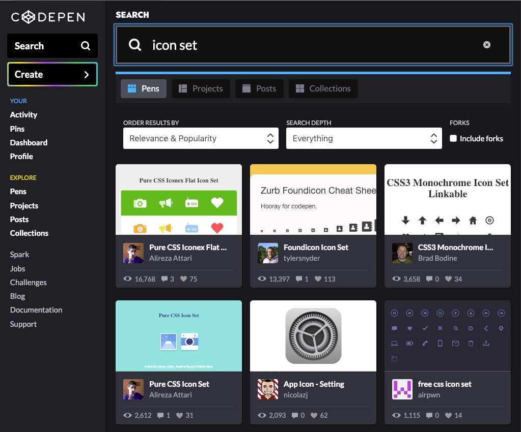
Thankfully, CodePen lets authors tag their work with keywords to identify relevant topics. Can't figure out how to code up a slick navigation bar? Searching the site for "navbar" returns a list of examples. Filter on pens if you're interested in just a working demo, or on posts if you're in the mood for a tutorial.

Search CodePen for solutions to a design problem.

Search CodePen for solutions to a design problem.

Once you find a few ideas, why not create and share a CodePen collection? A collection - which I cover later in the "Collections" section - can group together all the solutions you find for a particular problem.

#3: Find artistic inspiration

On the other end of the spectrum from targeted problem-solving, we find random inspiration. Searching for the muse, as it were. You have the time and motivation to create something beautiful, but don't quite know what.

If you get motivated by looking at masterpieces, I suggest one of three approaches.

  1. CodePen TV. The easiest (i.e., laziest) way to catch inspiration is to just point your browser to CodePen TV for a rolling highlight reel of picked Pens. When something catches your eye, just click the work's link at the bottom to explore how it was made.
  2. CodePen Spark. A weekly round-up of the CodePen staff's picks, CodePen Spark lets you browse the best content on the site by topic. You can also sign up to get each week's Spark by email, which can serve as a reminder to spend time each week learning by example.
  3. The home page. If neither of the first two techniques works out, you can always just scroll down the CodePen home page in the hopes of stumbling across something you like.

Visit CodePen Spark for a weekly roundup of inspiration.

Visit CodePen Spark for a weekly roundup of inspiration.

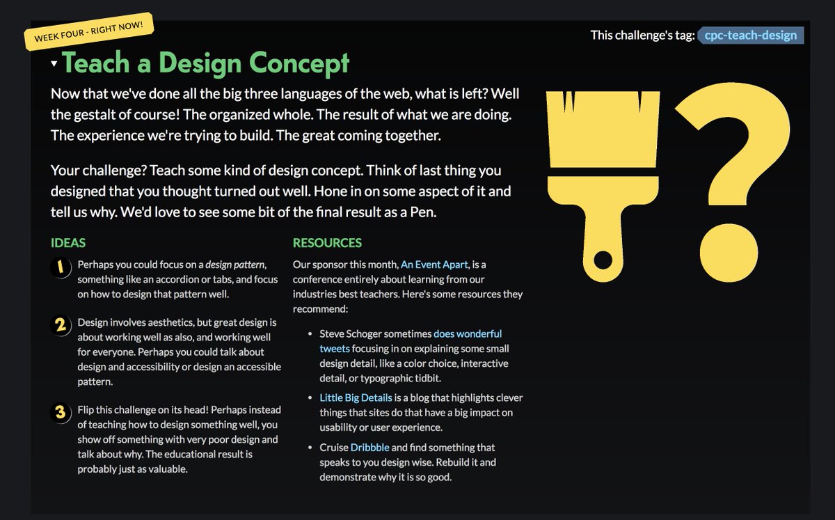
By contrast, if a daring competition speaks to you, try a CodePen challenge. Each week the CodePen staff announces a prompt and encourages the community to create Pens for the theme. Submit your finished Pen with the week's tag and check out what others have done. For example, this week's challenge asks participants to creatively use circles.

CodePen challenges encourage you to create a Pen from a prompt.

CodePen challenges encourage you to create a Pen from a prompt.

#4: Document bugs in open source software

If you've never maintained an open-source software project, here is how troubleshooting a bug in the project's code typically happens:

  1. You're making a web app.
  2. You decide to use an open-source library in your app. You have probably never met the people who wrote this library.
  3. Your app probably uses more than just this library. It likely uses other libraries and a bunch of your own code, too.
  4. Your app hits a snag.
  5. After a bit of troubleshooting, you suspect the open-source library is causing the problem.
  6. You open a bug ticket on the library's GitHub project, claiming the library broke their app.
  7. One of the library's maintainers asks you to reproduce the bug in a Pen. (They might mention JSFiddle, StackBlitz, or something other code hosting tool.) And though they might not say it, they also want your example to use just their library and as few other external dependencies as possible.

Here's the important thing: When these folks ask you to reproduce the bug, they aren't trying to be a pain. It's just that they probably have no idea how you wrote your app, which other libraries you included in your app, or any of the other dozen things that could cause the snag you're experiencing. They're trying to work with you to prove that their library is causing the problem. Their approach is straight out of Troubleshooting 101: determine the precise cause.

CodePen is a useful tool for documenting and sharing these demonstrations of bugs. So let's revisit the story and see how you can have a stronger impact by using Pens:

  1. You're making a web app which uses an open-source library.
  2. Your app hits a snag.
  3. After a bit of troubleshooting, you suspect the library is causing the problem.
  4. You open a bug ticket on the library's GitHub project, claiming the library broke their app. In the initial description of this ticket, you provide a Pen which recreates the bug in the smallest possible environment with the least dependencies. You've essentially proven via example that the library is very likely to be the culprit.
  5. The library's maintainers accept your Pen as proof of your claim and dive straight into the work of fixing their bug.

See the difference?

This brief post explains why these kinds of minimal test cases are so useful.

#5: Share ideas and accomplishments

At its core, CodePen is a community. While you can work in isolation, you'll get the most value from the platform by socializing. Try these easy steps whenever you come across an impressive pen or post:

  • Click the heart icon in the top right to help surface the best work on CodePen. You'll also be able to find the pen again more easily later.
  • Share the pen on social media.
  • Add the pen or post to one of your public collections. Don't worry if you don't know what how to do this right now - I cover it below.

You can also use CodePen as a venue to strut your stuff. If you work professionally as a web developer or designer - or want to - a curated set of shining examples of your work will go a long way toward impressing employers. You can even treat your CodePen profile itself as an online portfolio. Speaking of which...

#6: Use your profile as an online portfolio

Web designers live and die by our portfolios. I've been asked for mine in every interview with full-time employers or freelance clients. If you're a designer, you have to have one.

Approaches to implementing an online portfolio range from a fully hosted, What-You-See-Is-What-You-Get tool like Weebly to creating everything from scratch with no third-party tools. While each strategy has its pros and cons, I recommend one that does two things. First, your approach should showcase your ability to write HTML and CSS - after all, that's what people want to pay you for. Second, don't waste your time with all the technical chores of managing a website, such as maintaining a web server (unless, of course, that sounds fun to you). CodePen meets both of these needs.

I recommend creating your entire portfolio as a single CodePen project, deployed in production mode. I explain how to do that in the "Projects" section of this guide.

Animakuz implemented his personal portfolio as a CodePen project.

Animakuz implemented his personal portfolio as a CodePen project (https://codepen.io/animakuz/project/details/DBKNOZ).

I won't go into the details of how to design or build a portfolio since you can already find a bazillion tutorials on the web. I will say that when you share your impressive CodePen portfolio with potential client and employers, send them the link to your Pen's full page view, not the Pen view. I explain these options later in this post. For now, just note that most employers want to see your finished work first, then maybe dig into the code behind your portfolio.

Since we're talking about landing a job...

#7: Look for jobs

Maybe you're just into web stuff for the kicks. You don't care about money or employment and you just like pushing pixels as a hobby. Good for you! For the rest of us working stiffs who have to care about these pesky job things, CodePen makes it easy to find jobs pushing those pixels. Just hit the job board and start scrolling.

Of course, you will be a much more impressive applicant if you have a portfolio of shiny projects to show, so check out the previous item on this list if you haven't already.

CodePen offers a job board for web designers and developers.

CodePen offers a job board for web designers and developers.

Now that you have a clear idea of what to use CodePen for, you might wonder how to use it. So...

Things you can do with the building blocks of CodePen: Pens, projects, posts, and collections

We've covered the broad strokes of things you can do with CodePen in general. In this section, we'll explore things you can do with the smaller, individual components. When you create stuff on CodePen, you're going to use one of four types of content. Let's look at them one by one.

Pens

The Pen is CodePen's defining feature, the sun of its solar system. It provides a simple mechanism for hosting a web snippet which makes something render in a web browser. You will probably use it for most of your essential work on the site. We'll cover how to create pens later in my section on the CodePen Editor.

You can view each Pen on the platform in one of three ways, with each way giving a different perspective. You can change your view of a Pen by clicking the Change View button.

First, the default Pen View shows the Pen's code editor next to its rendered result. The view is ideal for inspecting the code to learn how the author created what shows up on your screen.

The Pen View shows the Pen's code editor next to its rendered result.

The Pen View shows the Pen's code editor next to its rendered result.

Second, the folks at CodePen describe the Details View as being the "most sharable" view. Rather than showing you the Pen's mechanics, it's more oriented towards information about the Pen, such as the author, comments, and social data.

The Details View is more oriented towards the author, comments, and social data.

The Details View is more oriented towards the author, comments, and social data.

Finally, the Full Page View puts the spotlight on the Pen's rendered results. It doesn't show much else.

The Full Page View puts the spotlight on the Pen's rendered results.

The Full Page View puts the spotlight on the Pen's rendered results.

As with most simple things, however, a Pen has limitations. You only get three files: one HTML, one CSS, and one JavaScript. As you might have guessed, a Pen is ideal for demonstrations with a lighter code footprint. As your work becomes more complex and amasses code beyond a few thousand lines, you will probably start to see performance problems. In fact, at the time I'm writing this, CodePen even disables the save button on Pens with more than 1 MB of raw code.

So what is a designer to do if her work starts to grow beyond these restrictions? It's time to upgrade to...

Projects

The project is the Pen's big brother. It looks and acts more like an integrated development environment and hosting tool than a mere coding scratch pad. A project lets you manage and edit several files of various types and work on a much larger scale.

A CodePen project lets you manage more complex web programs.

A CodePen project lets you manage more complex web programs.

Here are a few things you can do in a project which you can't in a Pen:

As you might have noticed, projects aren't for the casual user. If you don't think you'll use these unique features, you're probably better off sticking with a basic Pen.

Posts

Of course, you can blog on CodePen. I'm not going into detail here, because... well... you do already know how to blog, right? If not, the internets offer a wealth of resources on the topic, like this one.

I will say that CodePen seems a natural fit for blogging about web design and development. After all, most people who visit the site are interested in those topics. While a Pen shows off the code and rendered results of a given technique, it's not a natural fit for explaining something in depth. So think about writing a tutorial post to cover in words what you couldn't convey in visuals.

CodePen user ilithya wrote just such a post, so give it a read when you get the chance.

Collections

Now we come to the final building block for CodePen users. Say you have found a bunch of neat pens which are all related in some way. Wouldn't you want a handy link to get back to them all again later? Sure, you could bookmark each of them in your browser, but that's boring! And bookmarks are hard to share. Thankfully, CodePen has sent collections to the rescue.

A CodePen collection groups Pens which have some useful or fun connection.

A CodePen collection groups Pens which have some useful or fun connection.

As you come across a Pen you want to add to a collection, use the "Collections" control at the bottom of the Pen's default Pens view. Collections show up in your dashboard and have a link which you can share with teammates.

Things you can do with the CodePen editor

Expecting an in-depth tutorial on every detail of how to use the CodePen editor? Oh, sorry. We're not doing that here. Yeah, yeah, I know: how can I write a tutorial on CodePen without exploring the editor's every nook and cranny?

But two facts remain. First, like all web applications, the CodePen editor evolves. It doesn't sit in a cocoon. So if I included a bunch of screenshots and words telling you where all the buttons are and what they do, this guide would go stale in short order. Second, the written word is a poor medium for documenting a user interface. For this reason, video tutorials and the plain old "clicking around on things to see what they do" approach are far better tutors.

So instead, I'll only talk about things you can do with the editor, not how to do them. If you want to read the how, check out the official CodePen documentation. The CodePen staff do the hard work of keeping it up to date, for which I am grateful.

Fork an existing Pen

Say you come across a Pen that looks somewhat cool or uses a technique almost flawlessly, but something is lacking. It needs a tweak. Don't waste time recreating the Pen from scratch. And don't steal the code by copying and pasting (not cool, bro). Instead, fork the Pen by clicking the "Fork" button in the Pen's default Pen View. This action copies the entire pen into a new one which belongs to you. Equally impressive, CodePen tracks how often a Pen is forked and by whom, thus giving some love to the original author. Isn't that nice?

Forking a Pen gives credit to the original Pen's author.

Forking a Pen gives credit to the original Pen's author.

Create a Pen from scratch

Creating a new Pen is the digital equivalent of stretching a blank canvass across your easel. It's great for doodling when you don't have a clear picture of where you're heading. But it also means you're going to write all of your code from scratch, so be prepared to work. I recommend creating a Pen from scratch only when you don't have a relevant Pen from which to fork.

Embedding a Pen

Finally, you can embed a Pen in another Pen, in a post, or pretty much anywhere else on the web. Click the "Embed" button on the bottom of the Pen's default Pen view to get started. Use the resulting dialog window to change things around in the embedded Pen to get the exact look you want. If the dialog's buttons don't give you enough control, you can always change the styling values within the code snippet itself.

CodePen makes it easy to change how you want an embedded Pen to look.

CodePen makes it easy to change how you want an embedded Pen to look.

7 habits for getting the most out of CodePen

  • Find a cool pen or project twice a week. Ask yourself “how did the author do that?” Read through the source code until you can answer that question.
  • Each time you face a thorny web design problem, search CodePen for solutions. If you find more than one, create a collection from them. Promote the collection on your blog or social media.
  • Submit an entry to a CodePen challenge at least once a month.
  • Each time you read a bug ticket for your favorite open-source web project, notice whether the issue has a demo which reproduces the bug in a minimal environment. If not, make one on CodePen. Add your demo to the bug ticket.
  • Sign up for the CodePen Sparks newsletter. Heart each Pen which tickles your fancy.
  • Each time you make a Pen which represents your best work, add it to your personal online portfolio.
  • Write a tutorial on a design or development topic once per month. Post it on CodePen.

Want to read more?

Quick Prototyping With Vue CLI 3

$
0
0

When you're like me (and a ton of other devs), you'll get an idea in your head that you want to start working on immediately. So you might clone a boilerplate you have stored in Github, spin up a new Pen (my usual plan of attack), serve an index file via Node, or one of a million other ways. Sometimes the effort to finally get to working on your idea can be a chore or perhaps you're lazy like myself. From my experience, those small ideas often evolve into projects that go into a Github repo and are comprised of multiple asset files.

This approach will help you get the other stuff out of the way and immediately get to work locally.

Why I love Vue

The benefit of working in Vue components is that you can have your HTML, styles and JavaScript all in one place--saving you from having to jump around in multiple files for something you might not have completely fleshed out.

Vue components are one of my favorite parts of Vue because of how modular and portable they can be. They're great for building and perfecting repeatable patterns, without project-specific stuff getting in the way. As long as they aren't overly opinionated, you can drop them into any Vue project you have going at any time.

To preface things, I'm far from any sort of expert when it comes to Vue. I'm a former-designer-turned-front-end-developer that has been coding since around 2001. I've built a few things with it (including my own site) and love every minute I'm working with it.

Give me the goods!

I'm gonna give you the tl;dr for getting things started. I am making the assumption that you're comfortable with the command line:

  1. Install Vue CLI:
    • NPM: npm install -g @vue/cli
    • Yarn: yarn global add @vue/cli
    • Confirm: vue --version -- this should return 3.x
  2. cd into your desired working directory
  3. Create your Vue component--let's call it Cat.vue
    • EasyMode: touch Cat.vue && code Cat.vue
  4. Open it in your favorite editor

Start working

First off, you'll want to get your HTML structure in place:

  <template>
  <div class="cat">
    <h1>🐈</h1>
  </div>
</template>

At this point you can technically run your app. Skip to that part.

But I want to use Pug! How do I do that?

First, you have to install the appropriate loader for it:

npm i -D pug pug-plain-loader

Now you can do this:

  <template lang="pug">
  .cat
    h1 🐈
</template>

Styling

To start working on something via Vue CLI, this is all you need. If you're simply prototyping your structure, this is fine, but most people will want to have some styles too:

SCSS:

You'll need the proper module to compile Sass/SCSS accordingly. For this tutorial, I'm only going to cover SCSS because it's what I use:

  1. In the directory where your Vue component is, run: npm i -D sass-loader node-sass
  2. Now you can do this:
  <template lang="pug">
  .cat
    h1 🐈
</template>

<style lang="scss">
.cat {

  h1 {
    font-size: 5rem;
  }
}
</style>

Easy!

Yeah, that's great, but I want my SCSS!

Hey, man, I'm getting there.

  <template lang="pug">
  .cat
    h1 🐈
</template>

<style lang="scss">
.cat {

  h1 {
    font-size: 5rem;
  }
}
</style>

There you go!

Note: scss is interchangeable with less, sass, postcss, etc.

JavaScript

Now for the last part of our fancy cat Vue component: ✨JavaScript✨

So for this one, we're going to simply write some JS directly in the mounted lifecycle hook:

  <script>
export default {
  mounted() {
    const el = this.$el // the main element within your Vue app
    const cat = el.querySelector('h1') // now you can target elements within your app
    cat.addEventListener('click', (e) => window.console.log(e.target))
  }
}
</script>

We are simply targeting the h1 element inside of our main Vue element, and attaching a click event to it for testing purposes. This is the easiest way to run JS when prototyping because it allows your JavaScript to run as soon as the Vue instance is mounted to the DOM and ready to go. If you wanted to get fancy and know your way around Vue, you could instead write your methods and leverage those instead. This would allow you to separate your functions nicely based on their context.

Your finalized Vue component

  <template lang="pug">
  .cat
    h1 🐈
</template>

<style lang="scss">
.cat {

  h1 {
    font-size: 5rem;
  }
}
</style>

<script>
export default {
  mounted() {
    const el = this.$el
    const cat = el.querySelector('h1')
    cat.addEventListener('click', (e) => window.console.log(e.target))
  }
}
</script>

Run it!

Now that you've got your basic prototype built out, let's see it in action:

vue serve Cat.vue

You should be prompted in the console to open a localhost url. Do that and you should see your component running. Yay! As you make changes, the browser will automatically reload to reflect them.

Have fun! 🎉

At this point the rest is up to you. You can build out everything you need within this 1 component and not have to go through the process of setting up a full-fledged project.

Resources

Inspire Yourself, Inspire Others!

$
0
0

Inspire Yourself

Background Info

I'm not sure if it's just me or if other people are/have had this issue. Where you have a great year with lot's of success but the next year you shoot higher but you've got not a clue how on Earth you are going to beat last year or take steps towards even more success. I for one and currently having this issue and have finally (as of today) found the inspiration I needed to keep going and pick up a style of coding again. Last year I started to seriously work on my CodePen portfolio and since have had exponential success on the platform with thousands of views, hearts, a follower base and even having the #7 spot on the most popular post of 2018! Because of how much success I was able to obtain in one year, it can be a little stressful to follow up with that. I know that others may think that it's not that big a deal and that this is nothing but those things were a big deal for me, dealing with Imposter Syndrome my whole life and thinking that I'm not good enough to be successful in this field. I want to thank Cassidy Williams for helping to spark inspiration in doing pure CSS pens again. Her pen "Circle Buddy" inspired me to make something similar to her's and use the same style (which I absolutely love!)

See the Pen Circle Buddy by Cassidy Williams (@cassidoo) on CodePen.

Here's what I made from it:

Which brings me to what I originally wanted to talk about...

Inspire Others

Knowing not just from seeing it but experiencing it myself, if you can inspire one person to do more, you can help make the world a better place and possibly change someone's life. I'm writing this article because (yes it may be obvious to some) but it is possible to run out of steam and it's tremendously discouraging to not have anything to work towards. CodePen has changed my life, it has opened doors for me that would have never been available if not for the amazing community. I plan on writing more posts this year (more tutorials, reviews) to help add some more beef to my portfolio.

I just want to say thank you to the CodePen community and heres to a successful 2019!

CSS Shapes Resources

$
0
0

Documentation & Guides:

CSS Shapes - MDN

Overview of CSS Shapes - MDN

<basic-shape> - MDN

shape-image-threshold - MDN

shape-margin - MDN

shape-outside - MDN

CSS Shapes Module Level 1 specification - W3C

CSS Shapes Module Level 2 specification draft - W3C

Blog Posts & Articles:

CSS Shapes 101 - Sara Soueidan

Moving Forward with CSS Shapes - Sara Soueidan

Animating CSS Shapes with CSS Animations and Transitions - Sara Soueidan

Using CSS Regions With CSS Shapes For A Better Reading Experience - Sara Soueidan

Take A New Look At CSS Shapes - Rachel Andrew

People Talkin’ Shapes - Chris Coyier

CSS Shape Editors - Chris Coyier

Experimental layouts with CSS Shapes and clip-path - Michelle Barker

Breaking Down Boxes with CSS Shapes - Amelia Bellamy-Royds

A Redesign with CSS Shapes - Eric Meyer

Why you should be excited about CSS shapes - Chen Hui Jing

An Introduction to CSS Shapes - Tania Rascia

Videos:

Obliterate Boxiness with CSS Shapes - Jen Simmons

The Firefox Shape Path Editor - Jen Simmons

Building a Richer Storytelling Experience with Alice in Wonderland - Adobe

Podcasts

Jen Simmons and Intrinsic Web Design - Shop Talk Show

Talk Slides:

Breaking the norm with creative CSS - Aga Naplocha

CSS Shapes & Friends - Nicky Thompson

Helpful Tools:

Shape Path Editor - MDN

Dynamic Drop Caps - Andy Barefoot

Can I use css shapes? - Caniuse

Examples:

CSS Shapes - Jen Simmons

CSS Shapes, Columns and Clipping - Mandy Michael

CSS Shapes Collection - Kristopher Van Sant

Demo for Alice's Adventures in Wonderland - Adobe

Inspiration:

shapes of text Pinterest board - Kristopher Van Sant

Quick AngularJS Beginner Guide

$
0
0

Overview

This is not a guide on what AngularJS is and how to make anything and everything. This is for those who want to get a feel for what AngularJS has to offer. I hope you enjoy.

tl;dr - not a complete AngularJS guide

Declaring Your Display Area

In order to get text from a JS file to display on your website, you need to declare where on your HTML document you're going to display it. In order to do this you will need to go into your JS file and type in as follows:

  var app = angular.module("myApp",[]);

Keep in mind that you do not need to name it "myApp", you can name it whatever you'd like or whatever suits the purpose of the site.

The Controller

The Controller is defined by a JS constructor function that is used to augment the AngularJS Scope. Type this under the previous script given.

  app.controller("mainController", ['$scope', function($scope) {
  $scope.title = 'text here';
}]);

Displaying the Contents

Finally we can edit the HTML document to our liking and be able to display the contents that we have been waiting so long to display:

  <body ng-app="myApp">
  <div class="main" ng-controller = "mainController"><h1>{{ title }}</h1></div>
</body>

Example

Conclusion

As I said in the beginning of this article, this was not in any means a in depth tutorial of how everything works, just a quick overview of the syntax of AngularJS and one of the simple things you can do with it. I hope this helped you to determine if this is a framework that you'd like to use in the future.

A job interview, Tim Berners-Lee, and the imaginary hot air balloon

$
0
0
Hot Air Balloon flying over the countryside
Photo by Kupono Kuwamura on Unsplash

Around twelve years ago, I went to a group interview (the company interviewing several people at once to review not only their answers but also the interactions among them). One of the activities was as follows:

Each of you is a celebrity/famous person of your choice, all in a hot air balloon flying over the countryside. Which celebrity are you?

Different candidates picked different people: one was Bono (from U2), another was José María Aznar, William Shakespeare, Bill Gates, Linus Torvalds... It was an IT project so there were a few more technology-related figures.

I picked Tim Berners-Lee, and proceeded to explain how I believed in the importance of the WWW, and how it opened the Internet to everybody, spreading content and knowledge, and opening unlimited opportunities to the world.

After we all explained who and why, they proceeded with the second part of the exercise:

The balloon is falling to the ground, and you need to drop someone to survive. Who do you throw out?

I was the first one thrown out from that imaginary balloon.

Many of the people in that room didn't even know who Tim Berners-Lee was! And nobody in there seemed to share my passion for the web or my vision of its potential.

Needless to say, I didn't get any job that day. And judging by how the project never came to life, it seems no one did (...at least not for long.)

But even now, over a decade later, I still wholeheartedly believe in the importance and potential of the Web. And if I had to go through a similar process (hopefully not, it was not a good experience), I would still pick Tim Berners-Lee.

...even if it meant being thrown out of an imaginary hot air balloon again.

A Case for Web Accessibility

$
0
0

One would think that by 2019, the argument about the necessity of implementing Web Accessibility would be over, that everyone would agree that Web Accessibility is fundamental, that it would be the norm, and that there would not be a need for articles about its importance like this one.

...And yet, here we are.

WebAIM recently published a study that analyzed one million home pages checking for accessibility issues, and the results were devastating:

  • 97.8% of home pages had detectable WCAG 2.0 failures.
  • 1 in every 13 HTML elements had a detectable accessibility error.
  • There were an average of over 50 accessibility errors per page.

In a world with over 1.1 billion people living with some type of disability, 15% of the world's population, these results are not acceptable. Especially if we are all -at least in theory- agreeing that Web Accessibility is essential.

These numbers alone should be sufficient to justify an accessible approach, but given the results exposed in the WebAIM study, they don't seem to be enough. So, here are some reasons why everyone should be implementing Web Accessibility:

Accessibility Affects Everyone

Due to the multimedia nature of the Web, people that are visually impaired are the most affected when a website is not accessible, but Web Accessibility has an impact on everyone, because:

  • ...blind people may not be able to see your content.
  • ...deaf people may not be able to hear your videos and audios.
  • ...people with reduced motor abilities may not be able to use a mouse.
  • ...older people may not be able to read small fonts.
  • ...people from rural areas may not have bandwidth to download big images.
  • ...users from developing countries may not have access to all resources.

As you may have noticed, not all the people from the list above match the stereotypical image of a user with disabilities, which is why Web Accessibility is so important: it will affect everybody in one way or another.

Many times, developers forget about the needs of people with disabilities because we don't identify or relate to them (one reason to add to why diversity in Tech is important), when truly we know many people that could benefit from Web Accessibility: your mother/father/granny/grandpa also want to read your blog, or you may find yourself in a place with little to no signal bars.

That is why emphasizing this idea is important: Web Accessibility applies to everyone.

Accessibility Is Good for Business

If being nice to everyone regardless of their condition is not your jam (you do you, as they say), here is a reason that may change your mind: by not having an accessible website, you may be losing potential clients who will take their browser and their money to an accessible competitor.

It is calculated that the people living with disabilities worldwide have a purchasing power of over 1.2 trillion dollars. The equivalent of the GDP of countries like Russia, Spain, or Australia. And this number goes up to over 8 trillion dollars if we count family and friends. This is not a number to ignore.

To put it in perspective, imagine that you own a shop, and after every 18 customers, you slam the door shut preventing the 19th customer from entering your store, losing their trust and their money. It sounds like a terrible business decision, right? But that's what many companies do everyday by not having an accessible website.

But there's more to this 19th customer that you need to worry about. You may have slammed the door shut for that particular customer, but they are going to talk about it to their family and friends, and their network may choose to boycott you too. The number of clients that you have lost is growing by the minute.

And that 19 is based only on blind users. Imagine if we took all disabilities into account! It would be slamming the door after every 5-6 customers... Definitely not good for business.

Accessibility Is Easy to Implement

"Accessibility is difficult to implement" and "accessible websites are ugly" are some of the main excuses that I hear when justifying not having an accessible product. Domino's even tried it in court. (Spoiler alert: it didn't work.)

But both of those statements are wrong. Accessibility is easy to implement, and your website will be as pretty as you design it to be (accessible or not).

This will be the most controversial point of all, and I understand that I may be stretching it a little bit. So let me be more specific: most of the Web Accessibility issues found on a home page are easy to fix and have solutions that are easy to implement.

Yes, there will be more complex components and structures that will require more work to make accessible, but many of the key points to Web Accessibility don't require complicated structures and they are fairly simple to integrate. Even in some cases, they are not even related to development but to content generation.

For example, here are five key factors that would improve accessibility considerably on any website:

  1. Adding Alt attribute to all images.
  2. Having well organized and structured headings.
  3. Ensuring good color contrast between content and background.
  4. Having meaningful and complete links.
  5. Using semantic HTML.

Raise your hand if you think those are difficult to implement. No one, right? I thought so. Why? Because they are incredibly easy to implement! And just correcting these 5 issues would fix 33% of all the problems found on the WebAIM study.

Accessibility Is the Law

If none of the previous reasons was enough, here's one that you may find more appealing: having an accessible website is the law. If your website offers a service, chances are making it accessible is not an option, but actually a requirement.

Many countries around the world have passed laws to protect the right of people to access content on the Internet, and that includes people with disabilities. If you offer an online service, by not having an accessible website, you may not only lose business, but also face severe economic penalties. (Ask Target or Domino's).

So, if you are not developing with Web Accessibility in mind, you may suffer the consequences later. You will need to redesign/redevelop your site (with all the attached costs) and you will have to pay a fine. So you would end up paying three times for something that should have been paid only once.

Companies redesign their websites every 3 years on average, and accessibility requirements have been in place since before 2016. So, there should be no reason why a company wouldn't have an accessible website.

In fact, Web Accessibility should be a cornerstone in the web development process along with security. Not an extra. Not a "we may do it later." But a base from which to grow your site. After all, it's the law.


I will write separate posts with tips and tricks to easily improve Web Accessibility. Meanwhile, you can visit this pen for a preview:


How You Can Get Started with CSS Grid

$
0
0

More like my slow journey with CSS Grid, but these things always sound cooler as a guide.

As I finish my 10th CSS Grid pen* (my 10th pen-niversary, if you will), I figure I might as well pen (ha!) some thoughts down.

Maybe the notes can help someone else along the way?

* I procrastinated so much finishing this, I released 3 more CSS Grid pens in the meantime 🤦‍♀️

Getting Started

I get intimidated easily to take the first step to try something out, especially if it's something really big. I think this happens to junior developers quite a bit (cough not that I am a developer cough).

CSS Grid got so much hype (as it deserves); I keep hearing about how awesome it's going to be that it ended up painting a certain, scary impression for me. I thought that it would be really complicated to implement, and just assumed that my lack of experience in coding will inhibit me from understanding or utilizing the concepts correctly.

So when CSS Grid was rolled out, it wasn't even on my radar to actually try it.

Until one day, I had an idea that I was very excited to try. I knew that the only way I could force myself to do something is just to dive in and figure it out along the way.

Something like throwing your kid into the pool to force them to learn swimming. Don't do this - it's scary and may traumatize your kid - but I suppose it is an acceptable metaphor for fun coding projects.

So armed with a CSS Grid guide, my journey began!

1. OK, Getting Started, For Real

The 3 properties are pretty much...

  display: grid
grid-template-columns: 300px 200px;
grid-template-rows: repeat(4, 1fr);

Bonus grid-gap property for the gaps.

  grid-gap: 10px;

If you lay down the grid track with these declarations, all the immediate child elements will just flow accordingly, in order.


A simple example is this bingo card here...

... with this grid track:

  display: grid;
grid-template-columns: repeat(5, 1fr);
grid-template-rows: 100px repeat(5,80px);

Honestly, that's really it. As long as you put your child elements in the right order, you don't need any more grid-related CSS.


This is my very first CSS Grid experiment, which is slightly more complicated than the example above but still very simple:

... which uses this grid track:

  display: grid;
grid-template-columns: repeat(9, 100px);
grid-template-rows: repeat(4, 100px);
grid-gap: 10px;


Additional useful information:

  1. repeat(x, y) is just an easier way to write the code. So, grid-template-rows: 200px 200px 200px auto; can be written as grid-template-rows: repeat(3, 200px) auto;.

  2. fr is the newest unit on the block. 1fr is one part of the available space. So if the width of the div is 500px, repeat(5, 1fr) means that 500px will be divided into 5 equal parts of 100px.

  3. The values of grid-template-rows and grid-template-columns are pretty much limitless*. You can put grid-template-rows: 200px 100px 200px 100px 300px 250px 150px; and keep going 🤔

* Not actually tested, but I did try this:

2. Properties for the Child Elements

Next up is properties for the child elements.

Two important things you can control is setting a) the position and b) size of the elements.

To get the long column where the lava lamp resides, the properties are:

  grid-row-start: 2;
grid-row-end: 3;

... for the child element.

Which means that you want the element to take up rows 2 to 3. This can also be rewritten as grid-row: 2 / span 2 where the first part is the row where the element begins, and the second part is the number of cells you'd want the element to span across.

Works exactly the same for columns!

3. Discovering Other Cool Things Along the Way

Using grid-auto-flow: dense, which forces child elements to fill in gaps if they can fit.

A quick demo here (keep clicking the black button):

This is my favorite property! You don't have to painstakingly specify the placement for each child element; very handy for portfolio items or photo galleries.


Overlapping child elements

I found out this feature very late in the journey 🙈, which then inspired my 10th pen. You can overlap elements and specify the order with z-index.

Overlapped the calendar events using z-index here.


Moarrr complicated grid tracks with grid-templates-areas

You can specify the grid track using names instead!

For example, this pen here:

The parent element has this property:

  .parent-element {
   grid-template-columns: 60px 700px 300px;
   grid-template-rows: auto 70px;
   grid-template-areas: 
      "title pie-recipe pie-image" 
      "context context pie-image";
}

Repeating the name means the child element will span across the cells.

In this example, element named context will take up two column cells and have a width of (60px + 700px). The element named pie-image will take up two row cells and have a height of (300px + 70px).

You 'name' the child elements by using the grid-area property:

  .child-element-for-pie-image {
   grid-area: pie-image;
}


Sounds complicated? This very comprehensive guide will help clarify things and they explain things a lot better than I do.


A tip for complicated grid tracks:

To get layouts done quicker, I always put a plain-colored background in each child element and play around until I get the layout right.

This is almost always the start of complicated grid tracks for me.

Before

After

Special Mention

Special mention to not attempt something like this. 😂


This was so much work 😭 The greatest thing about CSS Grid is flexibility and I absolutely love using values like minmax or auto for layouts.

But to use this approach for what I consider an illustration... let's just say I spend more than 2 hours trying to get things to align properly and to get each pixel right exactly where I want it to be.

Lesson learned: Think twice before using CSS Grid for illustrations.


Ok to be fair, I didn't really plan things properly. So I guess the advice here is plan first before executing.

How You Can Get Started Too!

Find inspiration from all around you and code it out! A lot of things can actually be transformed into a CSS Grid experiment.


Me everyday

Inspired by bathrooms.

I look at spreadsheets for my job every day.


But instead of me just saying, here's a list of things you can try:

  1. Easy: Chess board, comic book layout
  2. Medium: Restaurant menus, food nutrition label, tshirt labels, magazine layouts, a parking lot 😂
  3. Hard: Receipts, newspapers, dashboards, keyboards (both the instrument and the one you type on)

Don't be too alarmed about the items in the Hard list; they are not necessarily hard, they just have more components that require you to think or plan a little more when laying down the grid track.

I love doing unconventional use cases for experimentation purposes and seeing these ideas come to life... so yeah, I'm pretty much outsourcing my ideas because I don't have time to do them all.

Please try them 😂 and share your pens with me on Twitter!

How to Create Healthcare Dashboard with Flexmonster Pivot & FusionCharts

$
0
0

If you work in a medical center, you have a lot of data from different departments. Therefore, you need a reporting tool for tracking healthcare KPIs. 🏥

Should it be interactive? Undoubtedly.

Today we'll show how to create a dashboard that helps monitor the most essential information about patients and provides the management with a big picture of the hospital's performance. The whole process of setting up will take minimum steps and time. As a result, you will be able to generate reports based on the following data visualization tool:

We'll use two JavaScript libraries for this task - Flexmonster Pivot Table and FusionCharts.

Let's start!

📋 Add a pivot table to your web page

Add the scripts of Flexmonster and a container where it will be rendered:

  <div id="pivotContainer">The component will appear here</div>
<script src="https://cdn.flexmonster.com/flexmonster.js"></script>

Add a script that initializes a pivot table component with a basic configuration:

  var pivot = new Flexmonster({
    container: "#pivot-container",
    componentFolder: "https://cdn.flexmonster.com/",
    licenseFilePath: "https://cdn.flexmonster.com/codepen.key",
    width: 700,
    height: 350,
    toolbar: true,
    report: {
    }
});

Import data into a pivot table

Now it's time to set the report! Define a function which returns JSON data:

  function getData() {
    return [{
            "Birthday": {
                "type": "date"
            },
            "Date": {
                "type": "date"
            },
            "Gender": {
                "type": "string"
            },
            "Phone": {
                "type": "string"
            },
            "Waiting Time": {
                "type": "number"
            },
            "Satisfaction": {
                "type": "string"
            },
            "Division": {
                "type": "string"
            },
            "Patient Status": {
                "type": "string"
            },
            "Treatment Cost": {
                "type": "number"
            }
        },
        {
            "Birthday": "12-21-1960",
            "Gender": "Female",
            "Date": "01-02-2017",
            "Phone": "(373) 932-4038",
            "Waiting Time": 192,
            "State": "OK",
            "Satisfaction": "Excellent",
            "Division": "Oncology",
            "Patient Status": "Outpatient",
            "Treatment Cost": 322
        },
        // ..
    ]
}

And set it as a datasource for the report:

  report: {
    dataSource: {
        data: getData()
    }
}

Or simply enter the URL of the CSV/JSON data file.

  report: {
    dataSource: {
        filename: "URL-to-JSON-or-CSV-file"
    }
}

Next, put the fields to the rows, columns, and measures. Define your aggregation and add necessary report filters:

  "slice": {
    "reportFilters": [{
            "uniqueName": "Birthday.Year"
        },
        {
            "uniqueName": "Gender"
        }
    ],
    "rows": [{
        "uniqueName": "Division"
    }],
    "columns": [{
            "uniqueName": "Patient Status"
        },
        {
            "uniqueName": "[Measures]"
        }
    ],
    "measures": [{
        "uniqueName": "Treatment Cost",
        "aggregation": "sum",
        "format": "currency"
    }]
}

Customization

Now that you set up a slice, apply conditional formatting to your cells:

  "conditions": [{
        "formula": "#value < 6000",
        "measure": "Treatment Cost",
        "format": {
            "backgroundColor": "#29c3be",
            "color": "#000000",
            "fontFamily": "Arial",
            "fontSize": "12px"
        },
        "isTotal": false
    },
    {
        "formula": "#value > 12000",
        "measure": "Treatment Cost",
        "format": {
            "backgroundColor": "#f2726f",
            "color": "#000000",
            "fontFamily": "Arial",
            "fontSize": "12px"
        },
        "isTotal": false
    }
]

📊 Connect to a charting library

Include the scripts of FusionCharts and containers where the charts will be displayed:

  <script src="https://static.fusioncharts.com/code/latest/fusioncharts.js"></script>

<div id="barchartContainer" style="padding-top: 30px;"></div>
<div id="pivot-container" style="padding-left: 10px;"></div>
<div id="doughnut2dContainer"></div>
<div id="columnContainer"></div>

Then add Flexmonster's connector for FusionCharts:

  <script src="https://cdn.flexmonster.com/lib/flexmonster.fusioncharts.js"></script>

Bind a pivot table & charts together

Attach an event handler to the 'reportcomplete' event so as to know when the pivot table is ready to send the data:

  reportcomplete: function() {
    pivot.off("reportcomplete");
    createBarChart();
    createDoughnutChart();
    createColumnChart();
}

Add a function that creates a chart. In this function, you get the data from a pivot table and pass it to the charts as soon as the data is loaded to the grid or updated (filtered, sorted). This is an example of creating a bar chart:

  function createBarChart() {
    var chart = new FusionCharts({
        "type": "bar2d",
        "renderAt": "barchartContainer",
        "width": 550,
        "height": 350

    });

    pivot.fusioncharts.getData({
        type: chart.chartType(),
        "slice": {
            "reportFilters": [{
                "uniqueName": "Birthday.Year"
            }],
            "rows": [{
                "uniqueName": "Division"
            }],
            "columns": [{
                "uniqueName": "[Measures]"
            }],
            "measures": [{
                    "uniqueName": "Waiting Time",
                    "aggregation": "average"
                }

            ]
        }
    }, function(data) {
        data.chart.theme = "fusion"; // apply the FusionCharts theme
        data.chart.plotToolText = "$label<br> Waiting Time: $value";
        data.chart.caption = "Average Waiting Time";
        data.chart.subcaption = "by Departments";
        chart.setJSONData(data);
        chart.render();
    }, function(data) {
        data.chart.theme = "fusion"; // apply the FusionCharts theme
        data.chart.plotToolText = "$label<br> Waiting Time: $value";
        data.chart.caption = "Average Waiting Time";
        data.chart.subcaption = "by Departments";
        chart.setJSONData(data);
    });
}

Similarly, you can create any chart of your choice.

Don't forget to apply FusionCharts themes - it will make your charts look awesome!

Now you have a fully customizable interactive dashboard and can easily spot the trends in your data!

📉 Live Demo

Check the full code in our CodePen demo.

Setting up Pivot Grid & GeoChart to Show Data

$
0
0

Catch the tutorial on how to make a web report look more interactive and appealing.

Our goal is to create a dashboard with data in a table and a chart. The chart must be updated in real-time after data changing in the table.

Let's get the ball rolling!

To do this, we'll mix two JS libraries: WebDataRocks Free Pivot Table & Google Charts.

This road takes only 5 steps. There is also a ready-to-use code snippet that you can copy.

Move further on these steps!

Step 1. Load your data

After including a pivot table component into the web page, add a URL to CSV/JSON file with the data directly into the report. Just specify the URL to your file in a 'filename' property:

  filename: "URL-to-your-CSV-or-JSON-file"

Step 2. Configure the slice and aggregate the data

Next step - choose which data is going to be displayed within the rows and the columns.

For example, put the Country in the rows, Category in the columns. Define the measures and apply an aggregation function to them.

Step 3. Connect to the Charting Library

Add the loader of Google Charts by including the script into the web page:

  <script src="https://www.gstatic.com/charts/loader.js"></script>

Add the WebDataRocks connector for Google Charts

  <script src="https://cdn.webdatarocks.com/latest/webdatarocks.googlecharts.js"></script>

Add a container where the chart will be displayed:

  <div id="googlechartContainer"></div>

Add an event handler to the reportcomplete event by writing the following code in the configurations of the pivot table:

  reportcomplete: function() {
      pivot.off("reportcomplete");
      pivotTableReportComplete = true;
      createGoogleChart();
}

This event is fired when the data from the report is loaded and the grid is rendered. Create flags to track when the report and charts finished loading:

  var pivotTableReportComplete = false;
var googleChartsLoaded = false;

Load the charts from google.charts library and specify mapsApiKey:

  google.charts.load('current', {
'packages': ['geochart'],
'mapsApiKey': 'AIzaSyD-9tSrke72PouQMnMX-a7eZSW0jkFMBWY'
});

Step 4: Show the data from the pivot table in the chart

Start with adding functions for drawing and creating the chart.

Firstly, set the onGoogleChartsLoaded() function as a callback for the google.charts event handler:

   google.charts.setOnLoadCallback(onGoogleChartsLoaded);

Secondly, define createGoogleChart() and onGoogleChartsLoaded() functions:

  function createGoogleChart() {
if (googleChartsLoaded) {
    pivot.googlecharts.getData({
            type: "geochart" // specify the chart type
        }, 
        drawChart,
        drawChart
    );
}
}

function onGoogleChartsLoaded() {
    googleChartsLoaded = true;
    if (pivotTableReportComplete) {
        createGoogleChart();
    }
}

Thirdly, write a function which will be called once the data is ready or updated. It is responsible for drawing and updating the chart. Also, here you should specify the type of the chart you need. Optionally, define the color palette for the chart.

  function drawChart(data) {
      var data = google.visualization.arrayToDataTable(_data.data);
    var options = {
    colorAxis: {
        colors: ['#449544', '#4ca64c', '#7fbf7f', '#b2d8b2']
    },
    backgroundColor: '#b3e5fc',
    datalessRegionColor: '#ffffff',
    defaultColor: '#f5f5f5',
};

    var chart = new google.visualization.GeoChart(document.getElementById('googlechart-container'));
    chart.draw(data, options);
}

Step 5. Enjoy the result!

Finally, you can see how wonderful the pivot table looks in combination with Google Charts.

You can confidently change the data in the table and see how the results are reflected in the chart immediately! This is what we call a real-time interaction. Be open to new experiments - filter, sort the data, change the measures and the aggregation functions.

Getting new insights is closer than you think!

More links to check:

Lord of the Rings: Character Analysis with Flexmonster & Highcharts

$
0
0

Hi everyone!

We continue to analyze and visualize cool datasets from Kaggle. It's the most popular dataset platform among data scientists and analysts.

Recently we came across on the "Lord of the Rings" dataset. Being enthusiastic about data analysis and visualization, we couldn’t help but try to explore this dataset. And we can’t wait to share with you a superb web dashboard.

Hopefully, fans of "The Lord of the Rings" trilogy will love this tutorial. We made it simple and easy. You only need a new pen, two JavaScript libraries (Flexmonster and Highcharts) and a bit of desire to try new ways of data visualization.

Ready?

Let’s dive into the data!

Step 1: Add a pivot table to a web page

Add Flexmonster scripts:

  <script src="https://cdn.flexmonster.com/flexmonster.js"></script>

Add a container where your reporting tool will be rendered:

  <div id="pivot-container"></div>

Step 2: Load your data

  • Click the 'Connect' tab on the Toolbar and choose the data source:

  • Or define a function which returns the JSON data:

  function getData() {
    return [{
            "Film": "The Fellowship Of The Ring",
            "Chapter": "01: Prologue",
            "Character": "Bilbo",
            "Race": "Hobbit",
            "Words": 4
        },
        {
            "Film": "The Fellowship Of The Ring",
            "Chapter": "01: Prologue",
            "Character": "Elrond",
            "Race": "Elf",
            "Words": 5
        },
        // ...
    ]
}

And set it as a datasource for a pivot grid:

  dataSource: {
    data: getData()
}

Step 3: Set a slice report

   "slice": {
    "rows": [{
            "uniqueName": "Character"
        },
        {
            "uniqueName": "Race"
        }
    ],
    "columns": [{
            "uniqueName": "[Measures]"
        },
        {
            "uniqueName": "Film"
        }
    ],
    "measures": [{
        "uniqueName": "Words",
        "aggregation": "sum"
    }],
    "sorting": {
        "column": {
            "type": "desc",
            "tuple": [],
            "measure": {
                "uniqueName": "Words",
                "aggregation": "sum"
            }
        }
    }
}

No need to worry about flexibility - you can change the report later anytime. The drag-and-drop feature was designed precisely for the cases when you've decided to look at the data from a different angle:

Step 4: Connect to Highcharts

Add Highcharts scripts:

  <script src="https://code.highcharts.com/highcharts.js"></script>
<script src="https://code.highcharts.com/highcharts-more.js"></script>

Add a container for the chart:

  <div id="highcharts-container"></div>

Add the Flexmonster connector for Highcharts:

  <script src="https://cdn.flexmonster.com/lib/flexmonster.highcharts.js"></script>

Attach an event handler for the 'reportcomplete' event:

  reportcomplete: function() {
    pivot.off("reportcomplete");
    createHighChart();
}

'reportcomplete' is fired once the pivot table is ready to display the data.

Define the createHighcharts() function which creates and draws the chart:

  function createHighChart() {
    pivot.highcharts.getData({
            type: "column",
            "slice": {
                "rows": [{
                    "uniqueName": "Race",
                    "filter": {
                        "measure": {
                            "uniqueName": "Words",
                            "aggregation": "sum"
                        },
                        "query": {
                            "top": 10
                        }
                    }
                }],
                "columns": [{
                    "uniqueName": "[Measures]"
                }],
                "measures": [{
                    "uniqueName": "Words",
                    "aggregation": "sum"
                }]
            }
        },
        function(data) {
            data.title.text = "Top 10 Races By Spoken Words";
        });
    Highcharts.chart('highcharts-container', data);
},
function(data) {
    data.title.text = "Top 10 Races By Spoken Words";
    Highcharts.chart('highcharts-container', data);
}
);
}

You can specify a slice as an argument for flexmonster.highcharts.getData() so as to send the data which is different from the one that is displayed in the current report.

Step 5: Gain new insights from the data

Now that you've set up the dashboard, you can share it with friends and teammates who are as passionate about 'The Lord of the Rings' as you are!

🌟 See Live Demo

Useful links

The designer, the coworker, and the teacup: A story about critiquing design

$
0
0

A designer was asked to create a new teacup for a manufacturer of tableware. Preferring natural materials, she began by making a modest, thin cup from bamboo.

A coworker interested in design stopped by to see the cup.

“This is boring,” the coworker said. “Why don’t you make something flashier?”

“I tend to prefer simple things,” the designer said. “But perhaps you’re right. Maybe our audience would like something with a bit more energy.”


The next day, the designer showed the coworker a new cup circled by bands of vibrant colors.

“Much better,” the coworker said.

“I can see why you like the colors,” the designer said. “I showed this new cup to a test audience, though. Most of them found the colors a bit much and preferred something calmer. A few enjoyed it.”

“Well, I like it,” the coworker said, crossing his arms. “I don’t understand why people would want to drink tea from a boring cup.”

“The world has an infinite variety of people, and their tastes often differ,” the designer said. “It’s okay to have personal preferences. Just be honest about them and remember that others may like something else.


The next day, the designer showed the coworker a new cup, this time with only a single band of color around the rim.

“I like the color,” the coworker said, turning to leave. “It’s not as dull. But you should make it from iron instead of bamboo.”

“What do you mean?” the designer asked, confused.

“Make it from iron,” the coworker said, turning back to the designer.

“Why?”

“Well, bamboo isn’t the right material for a teacup. It’s too soft. If someone drops it, the cup could dent or crack. I’ve seen Japanese teapots made from cast iron, so do the same with the cup.”

“Ahh,” the designer said. “I understand you now.” She thought for a moment. “Our research suggests, however, that people want a cup light enough to lift up to their mouths many times. But now that I know the motivation behind your suggestion, I will make it sturdier.”


The next day, the designer showed the coworker a new cup made from hard ceramic with a single band of color around the rim.

The coworker knocked it on a table, observing that it did not dent or crack. He held it, noting its light weight.

“Good work,” he said.

“If I had taken your suggestion at face value,” the designer said, “many would have struggled with the cup. But by understanding the reasons for your suggestion, I addressed your concerns in a way which did not create other problems.”

The coworker nodded.

Suggestions are good,” the designer said. “The reasons behind your suggestions are just as important. When providing feedback, describe the problem you’re trying to solve.

The coworker thought for a moment, looking at the cup. “I imagine people spill their tea,” he said finally. “I spill things, but I always keep a napkin handy. How about a matching napkin?”

“Ooh, that sounds fun,” the designer said, smiling. “I’ve never made a napkin.”


The next day, the designer showed the coworker a napkin to go with the cup.

“Nice job,” the coworker said. “The two look good together.”

“I agree,” the designer said. “I just came from a tea tasting with a test audience, though. No one used the napkins. They said they didn’t want to wipe their cups and would prefer saucers instead.”

“Hmm,” the coworker said. “I never would have thought of that. I guess I don’t drink tea all that often.”

“I do,” said the designer, “and I should have predicted their reaction. But I got caught up in the excitement of making something new.”

“There is a lesson here,” the coworker said. “You are probably not your product’s intended audience. See with your users’ eyes, their goals, their problems.

The designer nodded.


The next day, the designer showed the coworker a saucer to go with the cup.

“You’ve done great so far,” the coworker said. “But we’re not providing a way to make the tea. People need teapots, right? How about a matching set of cup and pot?”

“Interesting idea,” the designer said. “That would take some time, though, and we need to finish the cup first.”

“If the manufacturer likes the pot, maybe they will buy that design from us, too.”

“I see where you’re coming from, but I don’t like to waste time. I’ll check with my contact first.”


"I admire your idea, but the manufacturer isn’t interested,” the designer said the next day. “They lack the budget to produce teapots.”

“I see,” the coworker said. “You didn’t already design a pot, did you?”

“No.”

“Good. I’m glad I didn’t waste your time.”

“It was a good idea,” the designer said, “but always consider design in the context of the product’s goals.

The coworker looked at the cup again.

“Do you like it?” the designer asked.

“I like it,” the coworker said.

Summary: How to effectively critique a design

  1. Having personal preferences is okay. Just be honest about them and remember that others may like something else. Instead of “this is boring,” try “I tend to like plenty of colors. This strikes me as kind of pale. Will it meet our users’ tastes?”

  2. Suggestions are good. The reasons for your ideas are just as important. When providing feedback, describe the problem you’re trying to solve. Instead of “we should add this page to the website’s main menu,” try “This page will be critical to our new users. I’m worried it will get lost among all the other content on the site. How can we make it easy to find?

  3. You are probably not your product’s intended audience. See with your users’ eyes, their goals, their problems. Instead of “Why do we waste money giving people instructions for using this? Anyone can figure it out,” try “I figured out how to use this right away. Will our customers? Perhaps we should conduct user research to see if they need instructions.”

  4. Always consider design in the context of the product’s goals. Instead of “Let’s add a dashboard to inform users of their coworkers’ recent activity,” try “Our goal is to give employees a tool for entering data. Do they need to know which data their coworkers already entered?”

Further reading

The book Discussing Design expands on this topic and provides a wealth of sound advice. The designer and coworker both recommend it.


Note: This story first appeared in UX Collective. I reposted it here to benefit the CodePen community.

Viewing all 980 articles
Browse latest View live